In contrast to previous years, the 2021 Census uses four separate household characteristics to define a set of dimensions for classifying households by deprivation. The ONS define these as follows:
- Education – A household is classified as deprived in the Education dimension if no-one has at least secondary (level 2) education and no-one aged 16 to 18 years is a full-time student.
- Employment – A household is classified as deprived in the Employment dimension if any member, not a full-time student, is either unemployed or disabled.
- Health – A household is classified as deprived in the health dimension if any member is disabled.
- Housing – A household is classified as deprived in the housing dimension if the household’s accommodation is either overcrowded, in a shared dwelling, or has no central heating.
From an analysis perspective, the way this data has been collected and presented limits the insight that can be derived. While the 4 dimensions are intended to represent different aspects of deprivation, there is some overlap between them. For example if a household includes someone who is disabled then they will meet the deprivation criteria for both the Employment & Health dimensions, and as such will be registered as having TWO dimensions of deprivation.
As the 4 dimensions are not ranked or identified in the data, it is impossible to establish the type of deprivation within an area. You cannot rank areas by any one specific dimension such as Employment or Housing. The data can only be used to measure the extent of overall deprivation. Since the raw data provides a count of households by the total number of deprivation dimensions that apply (i.e. 0, 1, 2, 3 or 4), it means that only generalised measures of deprivation can be derived.
How best to summarise the Census2021 deprivation data ?
At Newgrove, we have analysed and enhanced the raw data in a couple of ways. First we have calculated penetration rates of households by the number of deprivation dimensions – none (0), some (1+) or serious (2+). Of these, areas with a high proportion of households affected by two or more deprivation dimensions can be said to be the most deprived. Nationally 18% of households fall into this category, with individual MSOAs ranging from 44% in Lincolnshire to 4% in Manchester.
We have also derived an overall deprivation score for an area by calculating a household weighted sum of the four deprivation dimensions. This gives an overall score per MSOA ranging from 0.4 to 1.4 with an average of 0.74. The score represents the average number of deprivation dimensions per household in an MSOA, which can be indexed against the national average to identify areas that are more than 50% above or below average.
Which areas have the highest levels of deprivation?
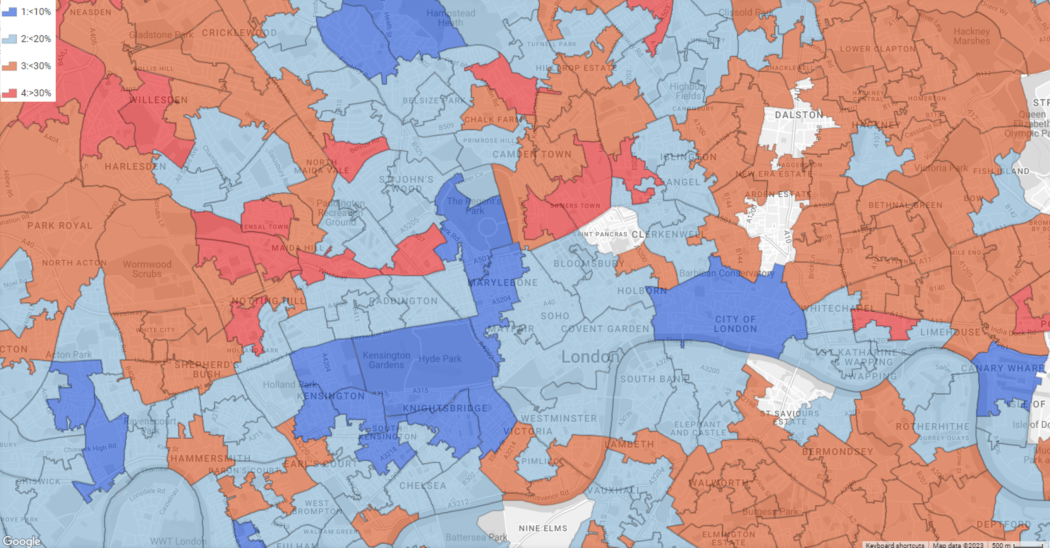
Looking at the number of households meeting all 4 dimensions would identify areas of extreme deprivation. The penetration of such households is only 0.23% meaning that nationally, the incidence of extreme deprivation is 230 per 100,000 households. While statistically a low overall penetration, it is interesting to observe that the areas with the highest levels of such extreme deprivation include the so-called wealthy London boroughs of Westminster, Kensington & Chelsea and Camden. In these and other areas of the capital such as Brent, Newham, Haringey & Hackney, the percentage of households meeting all four deprivation criteria is more than twice the national average.
Fig 1: % households with 2+ deprivation dimensions by MSOA in London

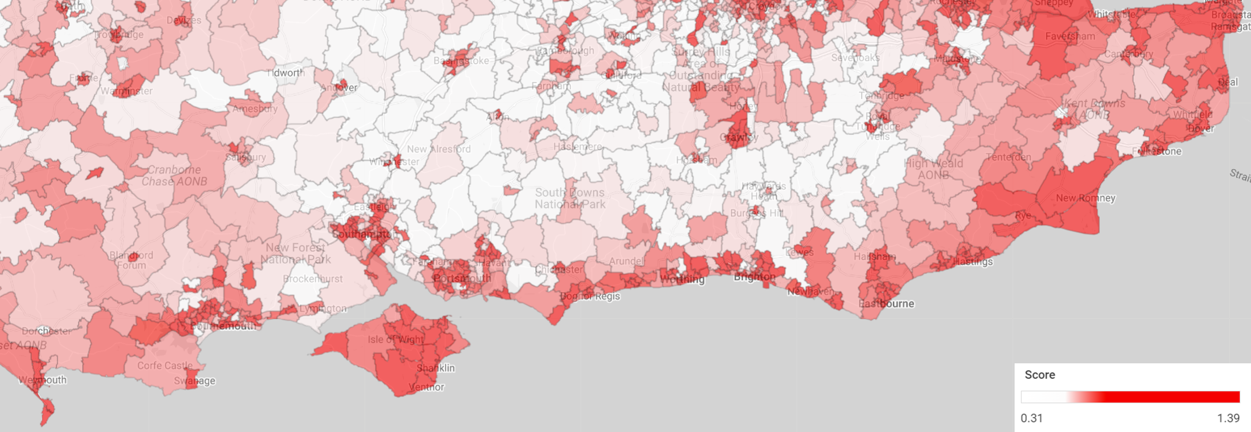
Outside London, the cities with the same high level of total deprivation include the seaside towns of Brighton, Eastbourne, Hastings & Bournemouth.
Fig 2 :Deprivation Score by MSOA across Southern England

As households can be classed as deprived across two dimensions if they contain a disabled person, it maybe more meaningful to rank areas on the % of households meeting the criteria of 3 or more dimensions of deprivation. Taking this approach identifies Knowsley, Liverpool and the Welsh towns of Blaenau Gwent and Merthyr Tydfil as having the highest deprivation levels.
What is the right way to analyse this deprivation data?
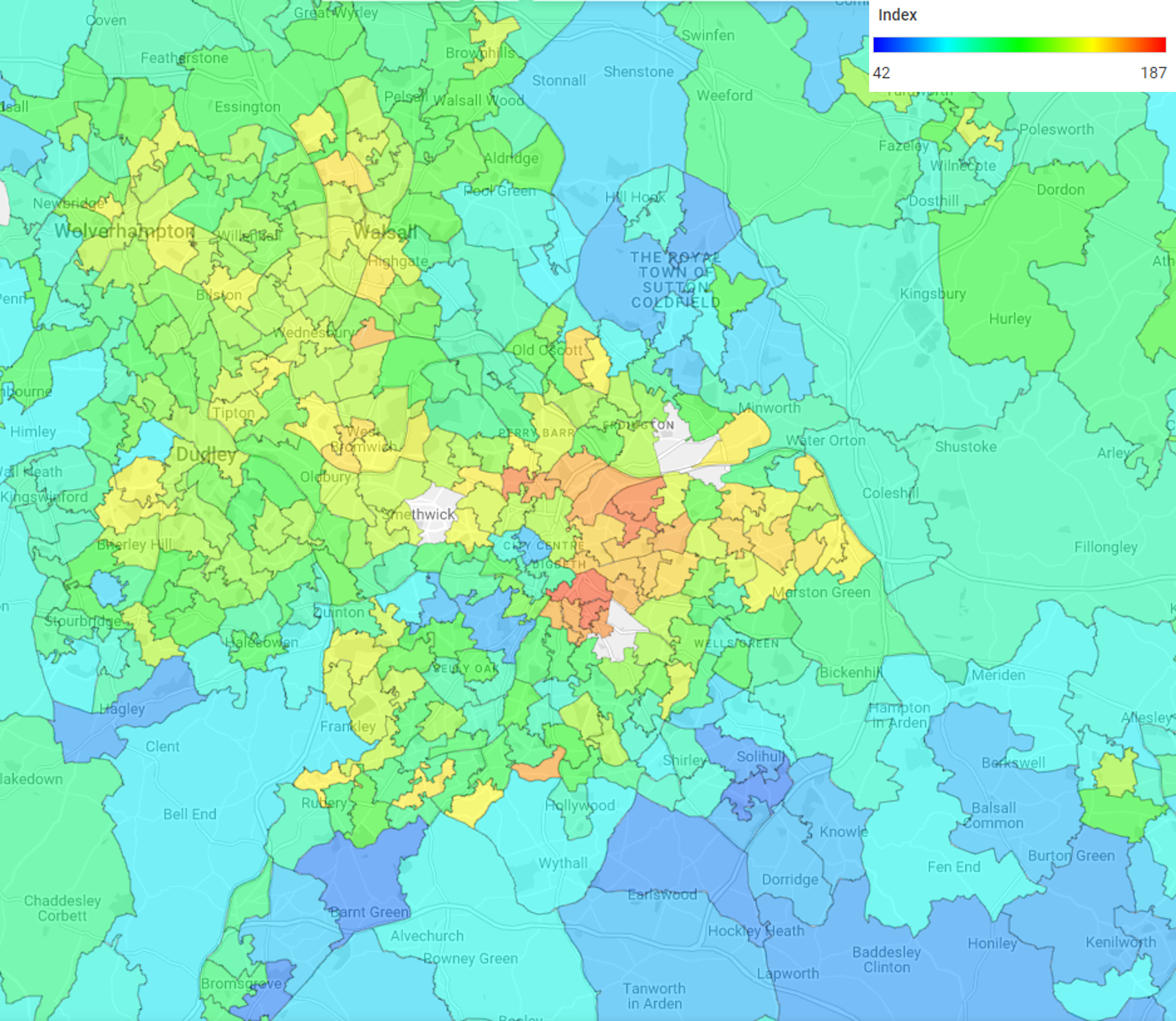
The above analysis has been conducted on the data released by the ONS at MSOA level. There are around 7,300 MSOAs in England & Wales each containing around 3,500 households. Each MSOA is named after the dominant town or city in the area and has a numeric suffix. There are 350 town & city names used in the MSOA labels. This means the number of MSOAs in different towns & cities varies from 1 (City of London) to 129 in Birmingham. As a result sorting & ranking the deprivation data by City name can be misleading. Geographically, some MSOAs will be on the edge of city areas, while others will be more central, and the variation in levels of deprivation between MSOAs in large cities like Leeds & Manchester can be huge. For example, the deprivation score across the 120 MSOAs in Birmingham ranges from 1.33 to 0.47 which is almost as much variation as there is nationally.
Fig 3 :Index of Deprivation Score by MSOA in Birmingham (100=Average)

The power of maps to pinpoint the most deprived areas.
This is where spatial analysis of the data in tools like Periscope becomes invaluable. Maps reveal where the real pockets of household deprivation can be found, particularly when the data can also be sourced at much more granular levels. The ONS release the raw Census2021 data at various levels of geography from Country or Region right down to Output Area level – 188,880 small areas each containing around 130 households on average. Naming individual OAs is almost meaningless such is the low level of geography they represent. Mapping this data is the only effective way to pinpoint areas with particularly high or low values.
To illustrate this disparity and show how deprivation levels can vary across a conurbation, the maps above show different measures of overall deprivation by MSOA. This is only half the story. When mapped at OA level the resolution achieved increases by a factor of 25 to maximise the utility of this data at its most granular level. Using powerful cloud based mapping tools like Periscope® is the best way to visualise data not just from the Census, but also many other datasets that have a geo-spatial component.
Newgrove will be releasing its enhanced version of the OA level deprivation dataset within the next few weeks, and it will be made available to all Periscope® users along with all the other population & location data layers that we provide as standard.
For more information on the data & analysis used for this post, Periscope® or other Newgrove services please get in touch by emailing info@newgrove.com.
