The date of the 2021 Census was Sunday 21st March – a date when the UK was still under lockdown restrictions imposed by the government to control the spread of COVID-19. This was the third national lockdown which started on 6th January 2021. Schools had only gone back on March 8th and it would still be another week before outdoor sports could resume and gatherings of up to 6 people would be allowed. It was indeed a strange time to run the 10 yearly Census of the population, and this context needs to be remembered when interpreting the data collected.
One of the more interesting datasets to be released by the ONS is the Travel to Work data. While this question asked how people would normally get to work, there’s no doubt those answers could have been influenced by the prevailing working conditions of the time, which included the wearing of masks indoors and social distancing in the workplace.
How does the working population of England & Wales get to work ?
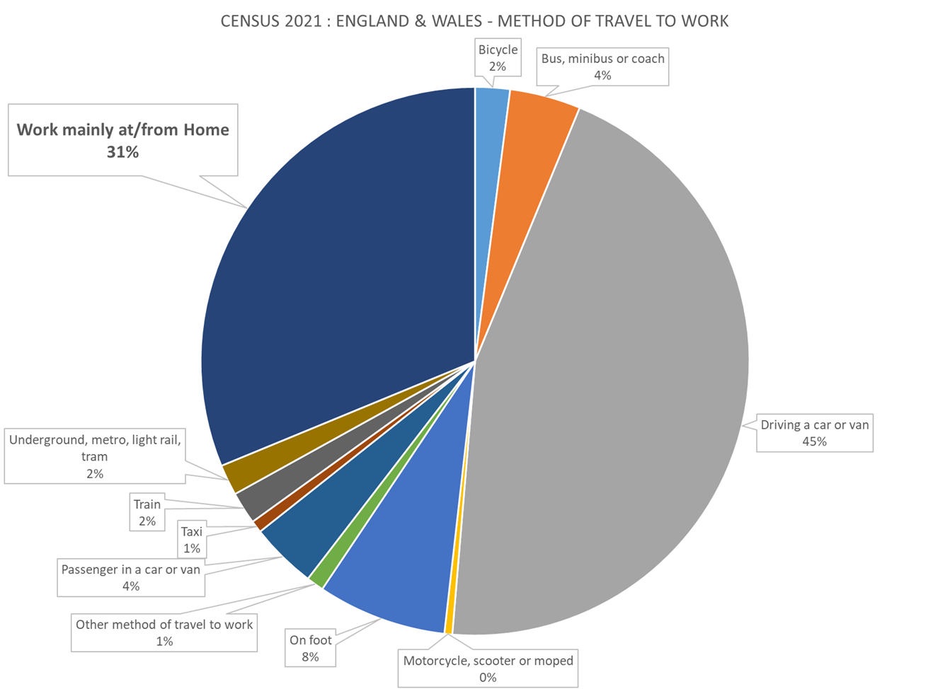
The chart below shows how the 28m people in work at the time answered the Travel to Work (T2W) question, and it reveals that 31% said they worked at or from their homes (WFH). This category was second only to the 45% still driving to their place of work, and reflects the shift to remote working that accelerated during the pandemic.
Analysing the T2W data at the ONS level of Medium Super Output Areas (MSOA) allows the data to be summarised by town to reveal the WFH hotspots in England & Wales. While Newgrove have loaded this data into Periscope at its most granular level – 188k Output Areas containing at least 100 people – the MSOA view enables whole towns & cities to be ranked as illustrated in the tables below.
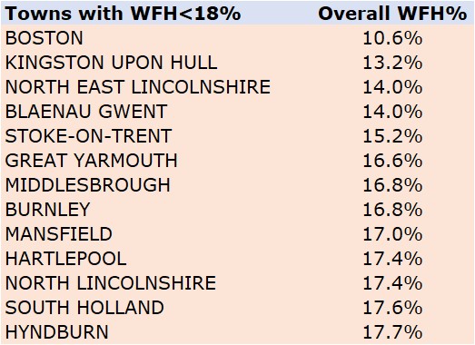
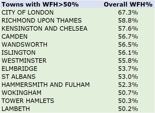
Somewhat surprisingly the central London areas of Camden, Islington and The City appear in the list of those areas with the highest WFH%. This could be due to lockdown restrictions in place at the time which instructed firms to advise their employees to work from home where possible. However this list also includes affluent commuter towns like St.Albans and Wokingham, which could reflect more of the long-term trend towards remote working, enabled by video-conferencing technology.
Working from home is not an option for everyone as the second table above shows. In rural areas of Lincolnshire, and the industrial towns in the North East like Middlesborough, Hull and Hartlepool, fewer than 1 in 5 of workers said they worked from home. This is unsurprising given that most of the employment in these areas will be in farms and factories where people need to be present at premises to do their jobs.
What classification does the Census use to determine Social Grade?
To determine if the above results were simply a consequence of government advice to ‘work from home if you can’ or indicative of a general trend, it is useful to examine correlations with other Census attributes. For example, understanding which occupation types and socio-economic groups were more likely to work from home (WFH) in March 2021 could allow that data be extrapolated into the future to predict those areas where remote working could indeed become the new normal.
Below is a chart showing the correlation between socio-economic group and working from home. Instead of using the classic ABCDE social grade classification so loved by media agencies, the ONS have used the more recently developed, and succinctly named National Statistics Socio-economic classification (NS-SEC) as a proxy for social class. Maybe this is compatible with the notion of a ‘classless society’ but not having the familiar social grade to cross-tab the new Census data presents a real challenge for the Marketing industry.
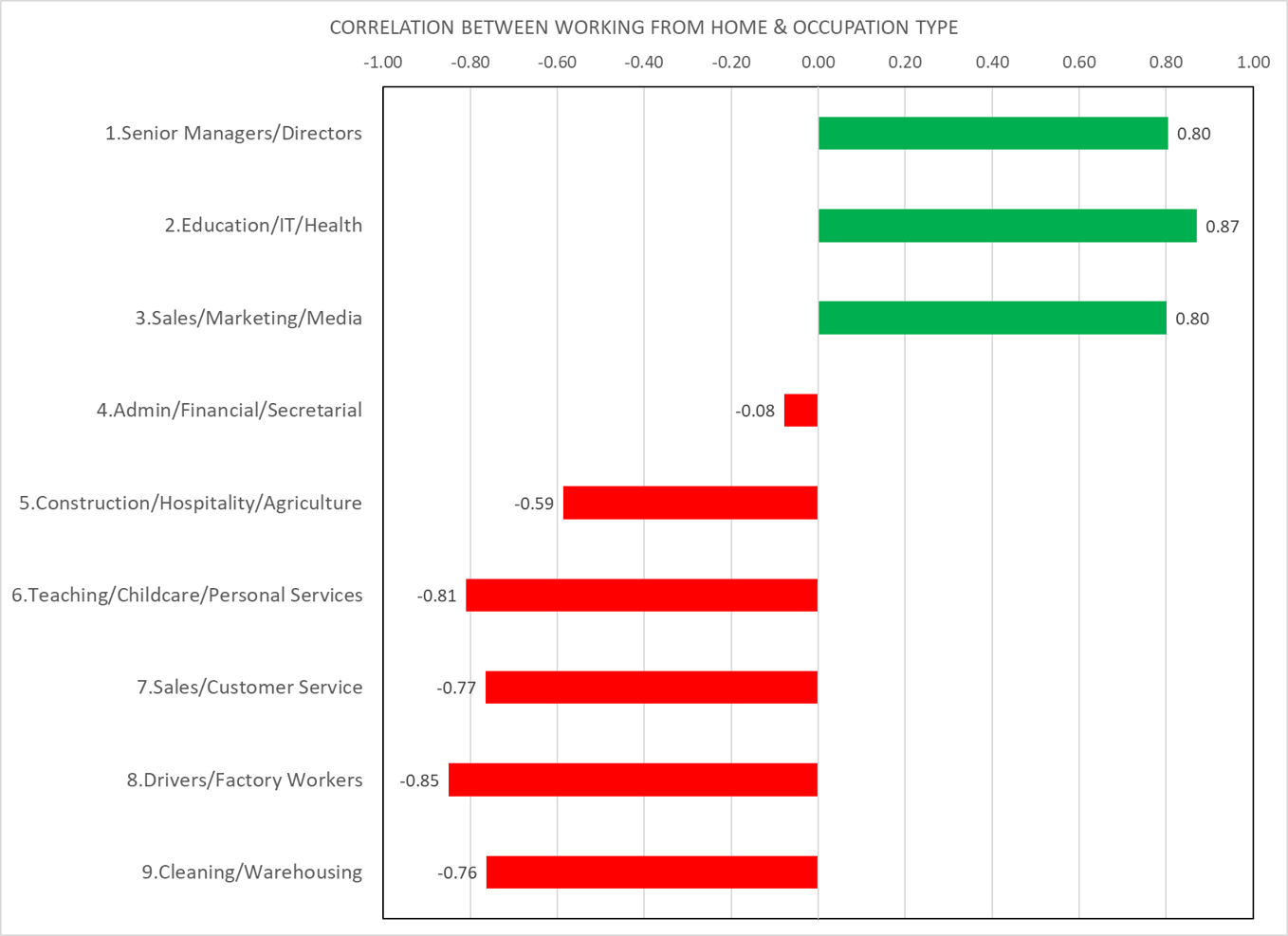
As it is defined, the SEC provides strong evidence to support the media narrative that working from home was a luxury for the Executive & Professional classes. For those ‘on the front-line’ doing more routine work there was less opportunity to work remotely. This is reflected in the negative correlation with the WFH% that is also seen in areas of high unemployment or students where any work available will have been more casual or temporary as delivery drivers, on-premise jobs in ‘essential retail’ like supermarkets, or hospitality roles in like bars, cafes and fast food restaurants.
A key driver of the SEC is Occupation type, so it is no surprise that the WFH penetration is also closely associated with this variable within the Census. The chart below shows the correlation of WFH with the different occupation types and confirms that remote working is much more prevalent among Senior Directors, Professionals and those working in IT, Sales & Marketing or Media. Managers in Healthcare and Education are also more likely to WFH although this will not include those working on the front-line as Teachers or Nurses.
Which areas of the country have more people working from home?
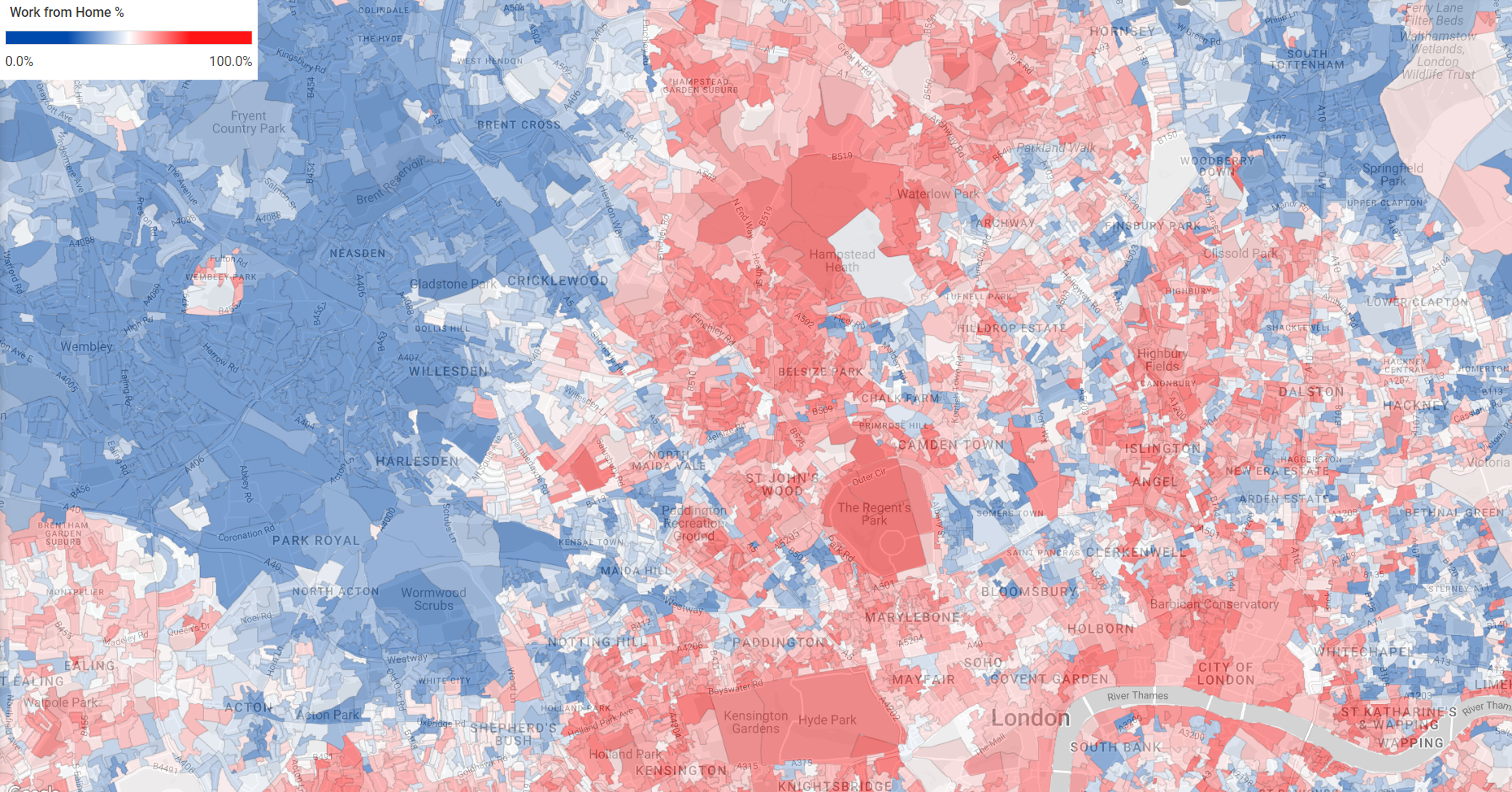
As people spend more time in their home neighbourhood and less time in urban centres, this is a key question for companies providing local services such as coffee shops, bars & restaurants. Newgrove works with a number of Gym companies and many of these have seen a drop-off in membership and attendance in their city centre locations, particularly in London. The map below illustrates the huge divide that exists between areas of London where people can or do work from home and those that can’t. People living in the more affluent areas of Kensington, Central London and the West End are much more likely to WFH, than those living in the outlying areas such as Wembley, Neasden and Park Royal. By definition, the key workers that London relies on to drive its taxis, buses or Tube trains cannot work from home, and so the areas where people in these occupations live will inevitably be more blue than red.
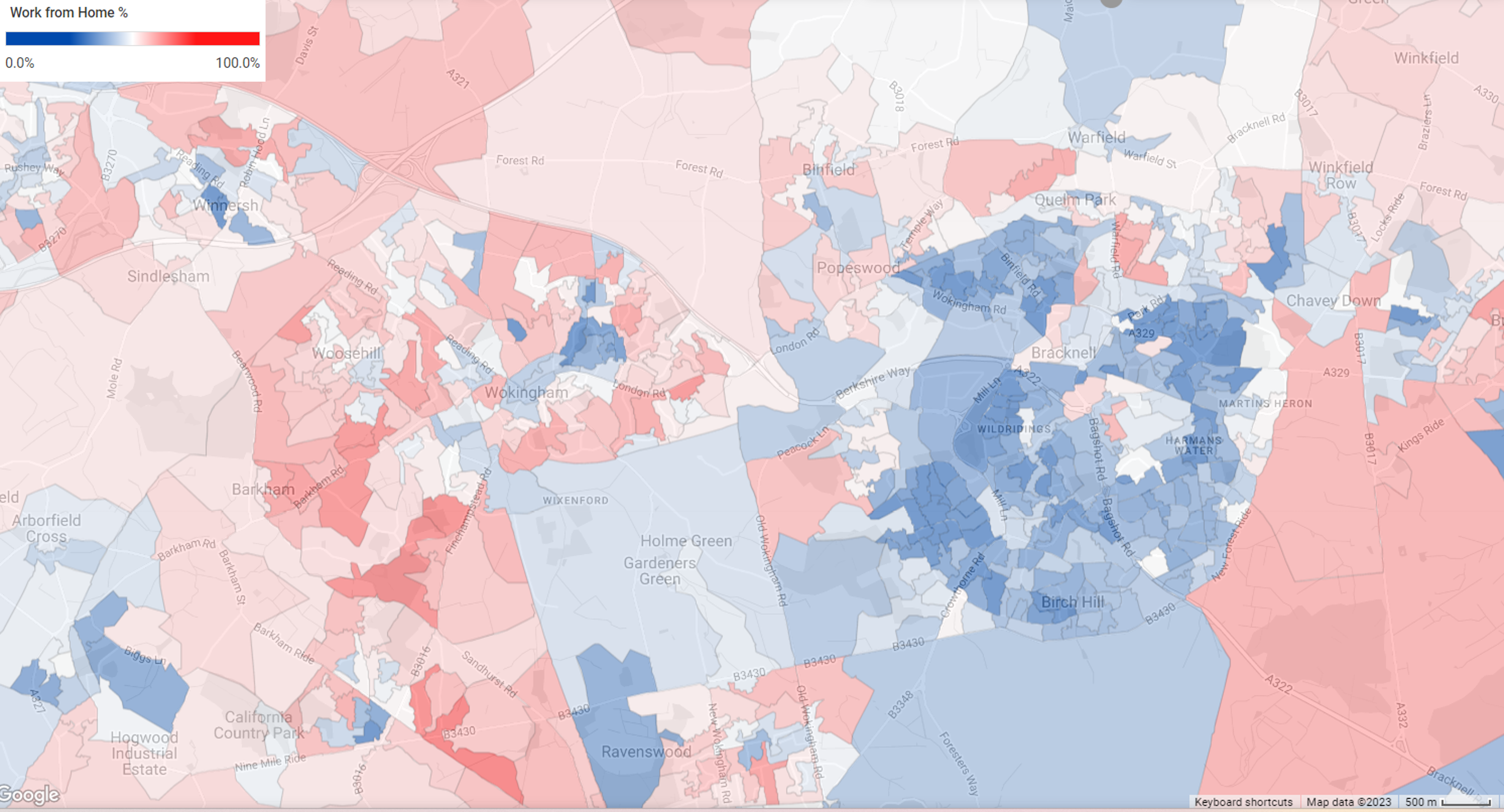
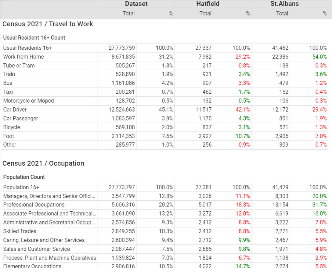
The picture outside London is more nuanced. It is tempting to think that there is a relationship between population density and the propensity to WFH, as it is more practicable for those living in larger homes with spare bedrooms and gardens. However this is not borne out by the data. Across the Home Counties some towns are more likely than others to have lots of their residents working from home. St.Albans for instance has a much higher WFH% than neighbouring Hatfield, as illustrated below. Similarly, Wokingham has more remote workers than Bracknell. Again this will reflect the mix of occupations as well as businesses in these areas.
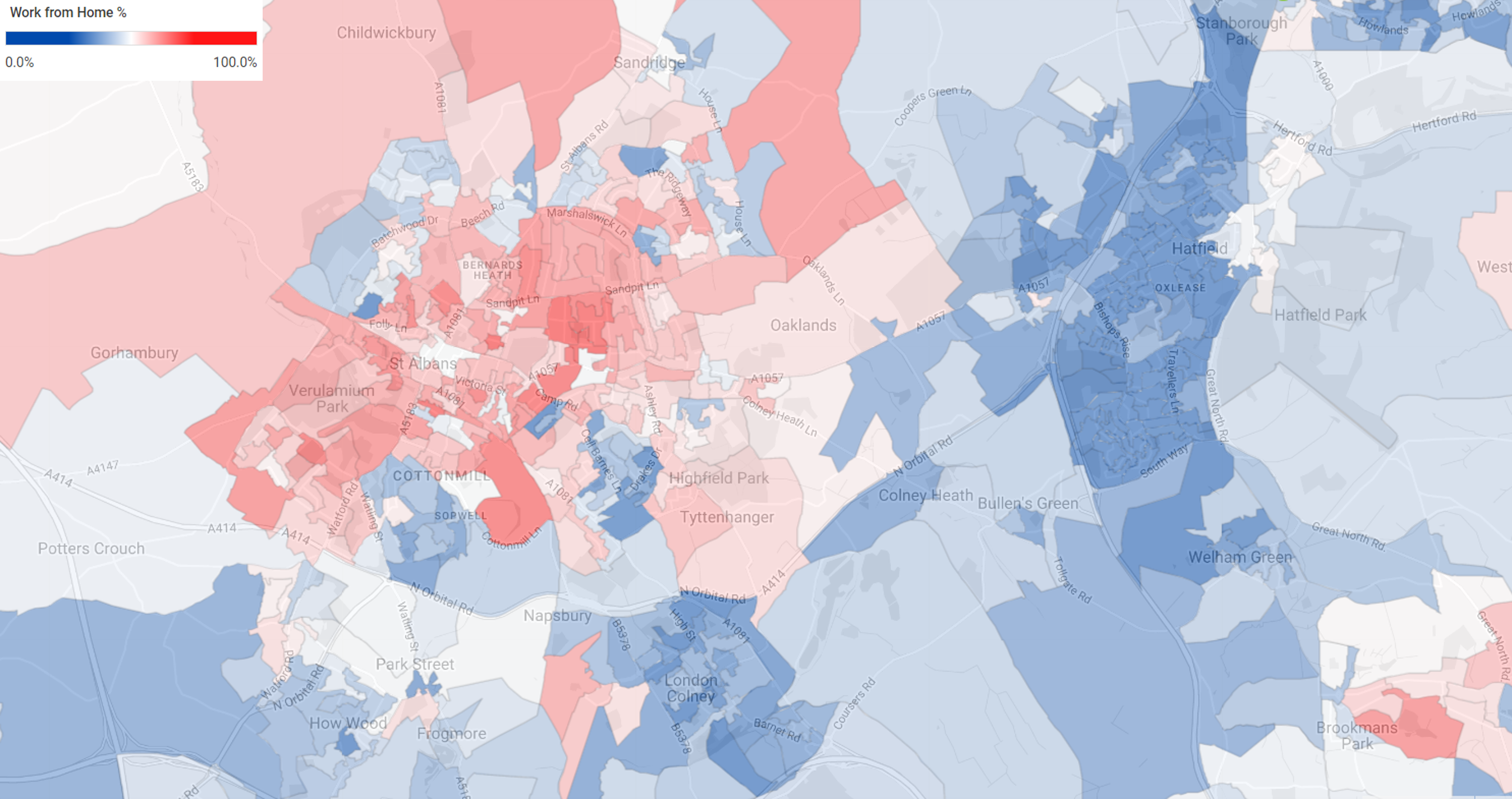
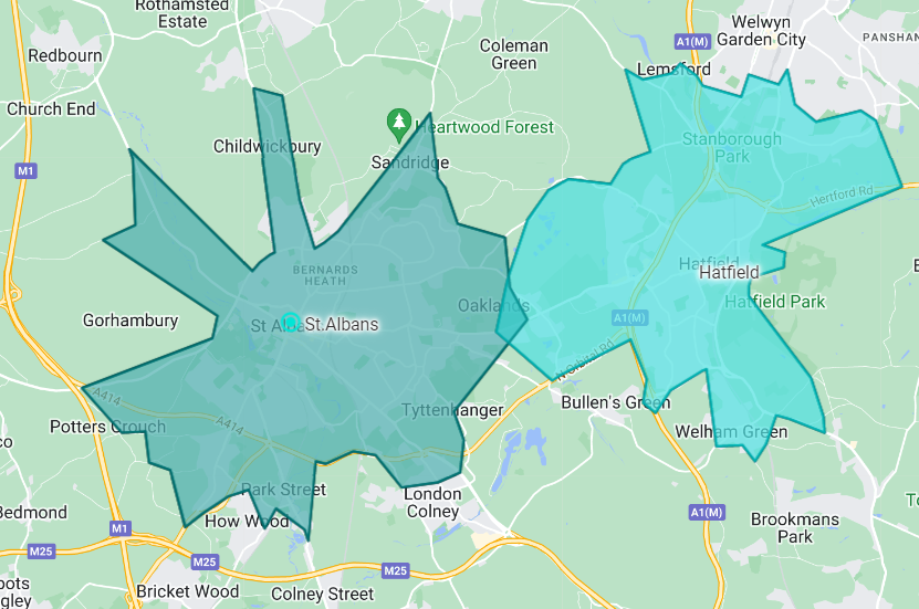
All the maps featured in this article have been generated in Newgrove’s mapping platform Periscope using OA level Census data. As well as providing powerful mapping capabilities for large datasets, Periscope also enables users to generate reports comparing two or more areas. In the example below, 15 minute cycle time catchment have been defined from the centres of St. Albans and Hatfield. This is possible using the travel time database built into Periscope that supports four different modes of transport. These two catchment areas have then been profiled against the whole Census21 datasets for Occupations & Travel to Work. The green or red green percentages indicate whether an attribute is respectively over or under represented compared to the whole dataset (i.e. England & Wales). The differences in the Occupation profiles of the two areas helps to explain why those in Hatfield are much less likely to work from home than their neighbours in St. Albans.
 This article illustrates the spatial insight that can be gleaned from the Census using a tool like Periscope. Such Insight and Data Visualisation is invaluable for Marketers and Retailers alike. If you would like to see Periscope in action and learn how the analysis functionality it provides and the extensive data it contains could benefit your business, then please get in touch for a free demo.
