The last ten years have seen unprecedented events like the pandemic and the associated lockdowns of 2020-21 bring about a huge amount of societal change. For marketers though, understanding how the profile of UK consumers has changed is what’s important when thinking about the demand for different products & services.
In recent months, the Office for National Statistics (ONS) have started to release the data collected from the 2021 Census. This enables some comparisons with the 2011 data to reveal how the country has changed in the last 10 years. To generate headlines, news outlets like the BBC have focused on where people of different ethnic origin now live and the penetration of different religions. However what businesses need to know is how local areas have changed in terms of size and age of the residential population.
Which areas have seen the most population growth in the last 10 years and how has the consumer profile changed in local markets across the UK?
With its extensive array of population & location datasets, including those from the latest Census, Newgrove is ideally placed to help businesses navigate these changes. Our Periscope® mapping & analysis tool allows users to visualise location data and overlay their own store catchments, sales territories or franchise areas.
For FMCG brands reliant on retail and wholesale distribution channels, knowing which areas now have more or less of their target consumers is invaluable for planning Sales & Marketing activity.
By analysing ONS population data by age for small areas, Newgrove have been able to identify which areas have grown and changed the most since 2011. While this data has been released at the granular Output Area (OA) level, we have summarised the data to Middle Super Output Areas (MSOAs) to identify some top-line trends. Note : this analysis is based on the ONS tables that provide population counts by age so will exclude people where age or date of birth has not been provided.
Overall, the ONS data suggests in 2011 there were 56.1m people living in the UK with an average age of 39.4 years. In 2021 the total population has increased 6.3% to 59.6m with an average age of 40.7 years – some 3.3% older.
As the ONS has changed the definition of some MSOAs from 2011 to 2021, creating new ones in the process, the following analysis is based on those areas that had the same geography at both points in time, where it is possible to do a like-for-like comparison. These unchanged MSOAs accounts for around 98% of the population where age data is available. In these areas where the geographical definition remains the same, our analysis reveals some interesting changes when comparing 2021 to 2011:
- Over 2m people now live in areas where the population has increased by more than 30% since 2011. Of these around 1 in 5 are in areas where the population has increased by more than 50%.
- In contrast there are very few areas where the population has decreased since 2011, with less than 380,000 people now living in areas where the population has decreased by more than 10%.
- Some of the towns seeing the most population growth over the last decade include: Aylesbury, Corby & Swindon – so called new towns surrounded by attractive rural areas close to major cities.
- Other areas experiencing a 50% or more increase in the residential population are Dartford, Bedford & Leicester – and the impact of inbound migration in these towns has been well-documented, and may be a reason why these places are now more congested than they were ten years ago.
- At the other end of the spectrum, places that have seen the biggest decline in the number of people living there include the London boroughs of Camden, Westminster and Kensington & Chelsea. Our analysis suggests these areas have seen a 20-30% fall in the number of people living there in 2021 vs. 2011. This may reflect the urban exodus of people from London to outlying suburbs and more rural areas brought on by the pandemic. Or it may also be due to changing property ownership in these areas with many more non-dom or expat owners who may well have been away for the Census, and thus are not counted as part of the population.
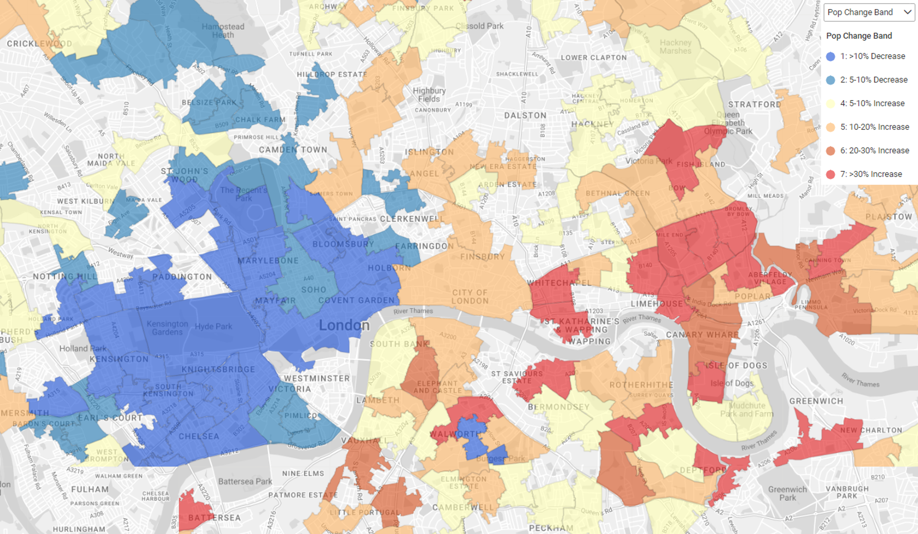
The Periscope® map of London below shows a marked shift in population from the West to the East of the city. The blue areas show where the population has declined by more than 5% or even 10% since 2011. This contrasts with the areas of East London in red where the population has increased. In 2021 there were many more people living in new housing developments and flats built in the last decade in and around areas like Whitechapel, Canary Wharf, Limehouse & Greenwich.
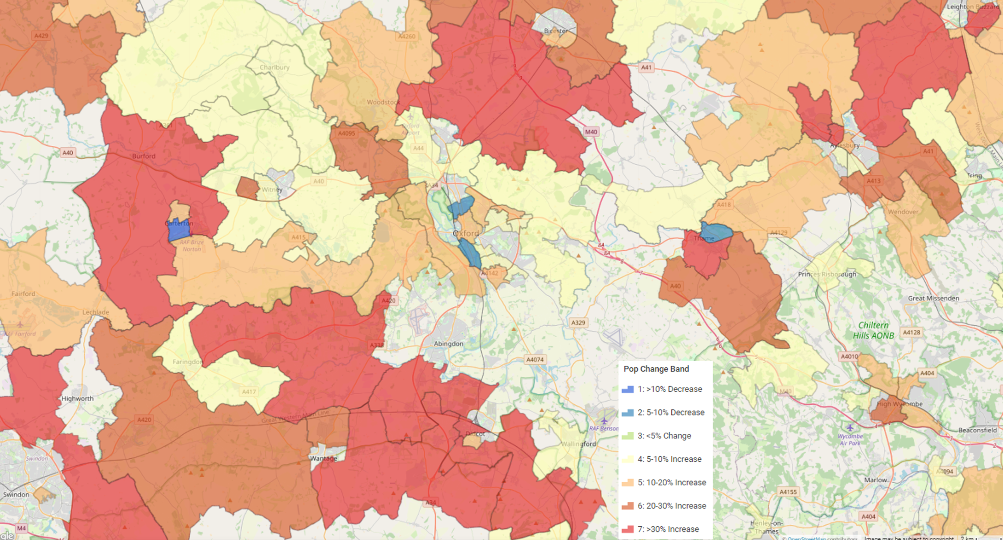
Elsewhere in the UK other population shifts become apparent when the data is mapped. For instance, more rural areas around Oxford & Abingdon have seen a marked increase as illustrated by the map below. This could be long-distance commuters moving out of London and taking advantage of improved road and rail services for getting into the City. Note the red areas around Didcot and the M40 corridor.
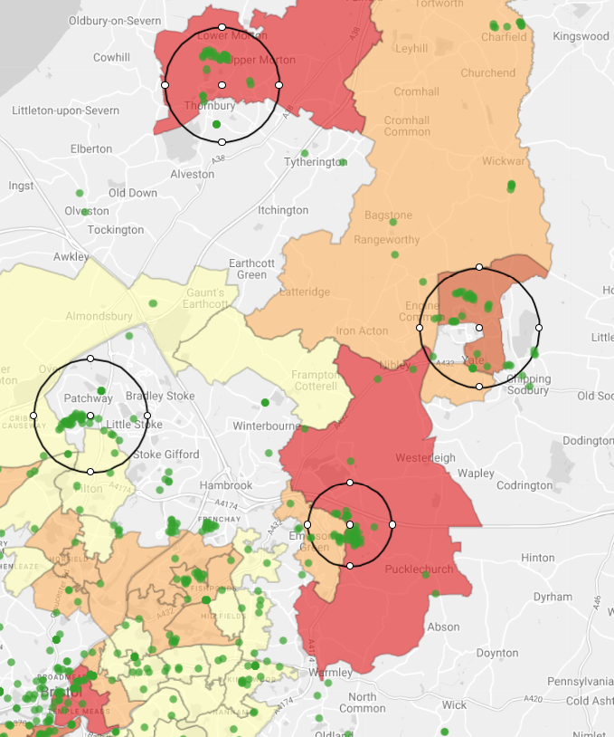
Of course some of this population growth could simply be the result of house building on the outskirts of existing towns & cities. This appears to be what’s driving the population increase north of Bristol as suggested by the green dots on the map below. These are the new residential postcodes in the 3 years prior to the Census 2017 to 2020, and are usually created for areas of new housing. The black circles highlight where clusters of new postcodes appear in areas shaded red where the population has increased by 20% or more.
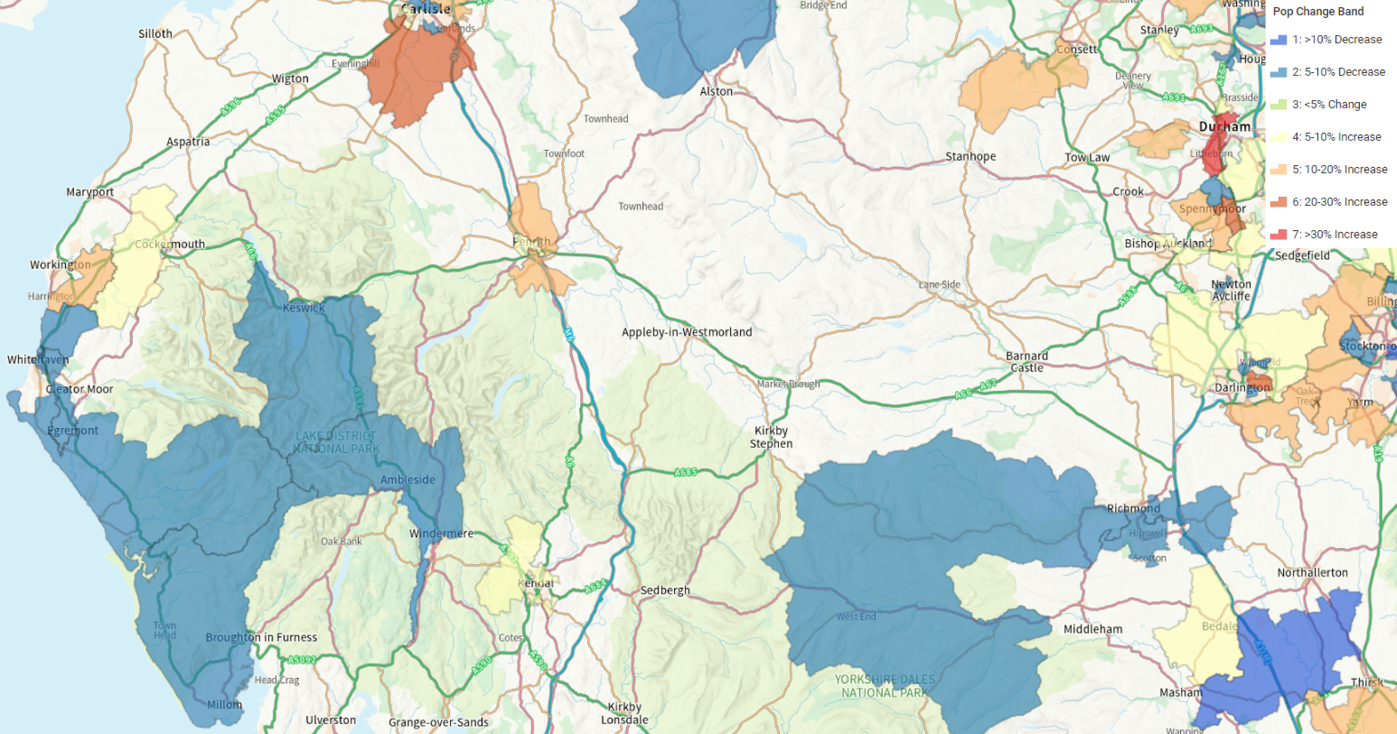
Further afield other population shifts become apparent when the data is mapped. For instance, there is also evidence of fewer people now living in the National Park areas of the Lake District and the Yorkshire Dales. The large blue polygons in the map below cover these Areas of Natural Beauty and while they have never been densely populated, the large % decrease suggests a trend that warrants further analysis. It could be due to an increasing number of second homes or holiday lets in these attractive parts of the country, meaning that fewer people were living there at the time of the Census.
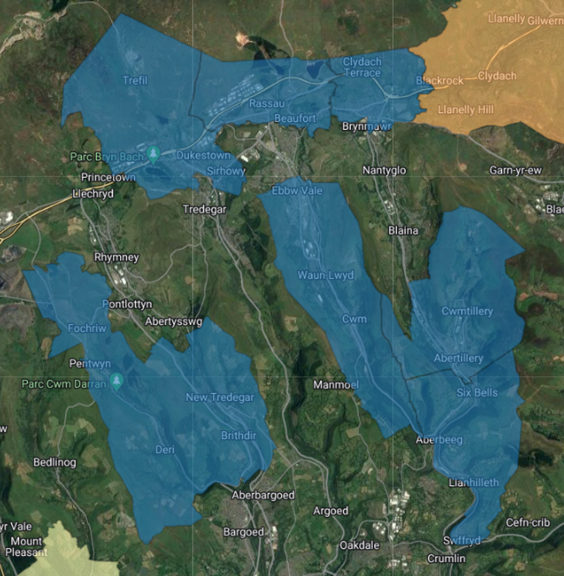
Another indicator of increasing living standards is the change observed in South Wales. In the former mining areas of the Welsh Valleys there has been a noticeable decrease in the number of people living there. Clearly, these communities have had to find alternative employment and people may have had to move as a result. Quality of housing stock in these areas may also be a factor, as those who can afford to seek to move away from the older terraced housing that was popular when the coal mines were still operating.
Trends like these require further analysis to explain why we have seen these population shifts since 2011. As more 2021 Census datasets are released, Newgrove will continue to highlight emerging themes by mapping the data in Periscope®. Look out for our next blog where we will explore how areas have changed in terms of the age and geodemographics of the people living there.
For more information about Periscope® or the data & analysis used in this article please get in touch by emailing info@newgrove.com

