We remember and manage everything better if we label, tag, summarise and group data to create better perspectives. Visualising the data increases our understanding, and the better our understanding, the more data we crave for, and in turn we generate even more data.
Currently 90% of the world’s data has been generated in the last two years alone and according to Deloitte, 80% of this data has a location element attached. The good old charts and graphs are still useful and we continue to use them, but in order to make the most out of geospatial data and break down its complexity, we need to consider alternative ways for data visualisation.
Here are 4 types of data visualisation that bring the “where” to data:
Thematic Mapping
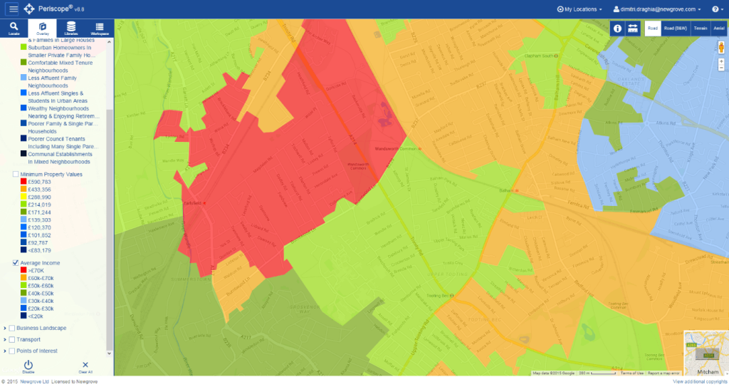
Thematic mapping can be used to indicate the various physical, economic and social elements, to name but a few. Depending on your data and the way in which it is represented, a symbol can represent more than one data label. In the example below you can see that, depending on the different types of average income, London areas have different colours to better represent data lables (high/low). More complex thematic maps can differentiate data by having different shapes that stand for various business units and by colour to appreciate total sales.

The main advantage of thematic mapping is the way it enables the viewer to quickly digest the high volumes of data through visual association.
Drawing and Querying
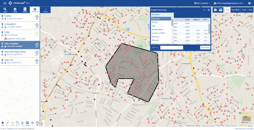
Let’s suppose you would like to isolate a particular geographic area and learn more about its demographic profile against your current CRM. If you have spatially-enabled your CRM, this should be a straight forward exercise.
By drawing and querying, geospatial data can be isolated to a specific area, enabling comparative analyses and segmentation. Using spreadsheets instead can prove to be relatively difficult and time-consuming, even when using smaller data sets.

Heat Maps
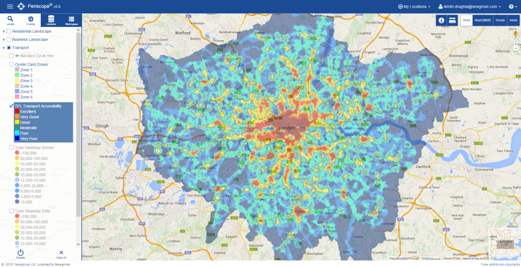
A heat map is a graphical representation of data where individual values are represented through intuitive colours; red could represent high values, blue low values. Everything in between these boundaries could then be colour-coded with graded variations of red and blue.
The geospatial data below shows transport accessibility for a geographic area; the scale is 1-10, 1 being ‘poor’ and 10 ‘excellent’. A heat map output of the data will immediately show the ‘excellence’ of Central London.

Data Points
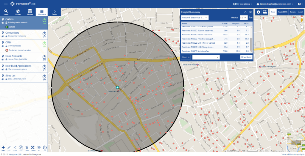
A data point is any single fact that can be represented graphically or numerically. Every entry in a database will generate a data point. Geospatial data sets have the advantage of being able to incorporate location and this is where this type of visualisation comes in handy.
Let’s suppose that a business wants to map CRM data of local customers for one of its branches. By mapping individual data points, the business can now appreciate the walk/drive time of every customer for example, and ultimately the factors that impact on the success of the business.

By leveraging the benefits of location analytics and by visualising customer data, strategists can make a significant difference to the performance of short-term and long-term business strategies.
