Last month we reported on the towns & cities that have seen the biggest change in their residential population by comparing 2021 Census data with 2011. This analysis was conducted at MSAO level, of which there around 7,000 such areas in England & Wales, each containing on average 7,700 people.
This blog delves deeper into the data to establish the type of areas that have seen the most change. The tool used for this analysis is the Output Area Classification (OAC) – a geodemographic segmentation of Output Areas built by the ONS using the 2011 Census data. OAC summarises the characteristics of the c.300 people living in each Output Area. More info on OAC is available here.
To highlight overall trends, the data has been summarised to MSOA level, with the dominant OAC type identified for each of the 7k MSOAs that represented the same geographical area in both 2011 & 2021. The OAC Groups & Subgroups provide a quick & convenient way of describing those areas that have seen the most change in the last decade.
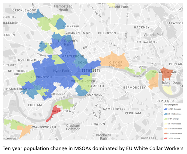
Brexit Led To An Exodus Of Skilled Workers From Central London
Where there has been more than 10% decrease in the residential population, 42% of these areas were classified as being ‘Aspiring & Affluent’ in 2011. Nationally less than 2% of areas are classified as this group, which means that ‘Aspiring & Affluent’ areas are more than 20 times over-represented in places experiencing the biggest population decrease.
Drilling into the data at sub-group level, we found that areas labelled ‘EU White Collar Workers’ made up around a third of those same areas where the population has declined by more than 10%. This supports the view that Brexit has caused a lot of EU workers to leave the UK – or at least move out of the London boroughs where they used to live. The overall population decrease in these ‘EU White Collar Worker’ areas was 4.8% compared to an overall increase of 5.8% for England & Wales.

Emergence Of Student Enclaves In University Towns
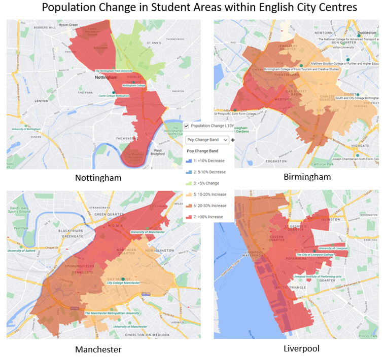
The other interesting shift revealed from our analysis is students moving out of ‘digs’ and private rented accommodation and into purpose-built halls of residence. Those areas classified as ‘Student Communal Living’ in 2011 are all in the top two bands of population growth, with increases of more than 20% over the last 10 years. In fact, the overall population increase in these areas is a staggering 27.8% – almost five times the national average.
As a result of these areas becoming dominated by students, their average age areas has reduced by 4.3% – the largest decrease across all 67 OAC sub-groups. This change reflects the growth of the student population nationally and the influx of overseas students to study at universities like Manchester, Birmingham, Liverpool & Nottingham. As the maps below illustrate, this would explain why areas classified as ‘Multi-cultural Student Neighbourhoods’ have also seen a large increase, growing by 19.2% since 2011.

Inbound Migration Of Skilled Workers From India
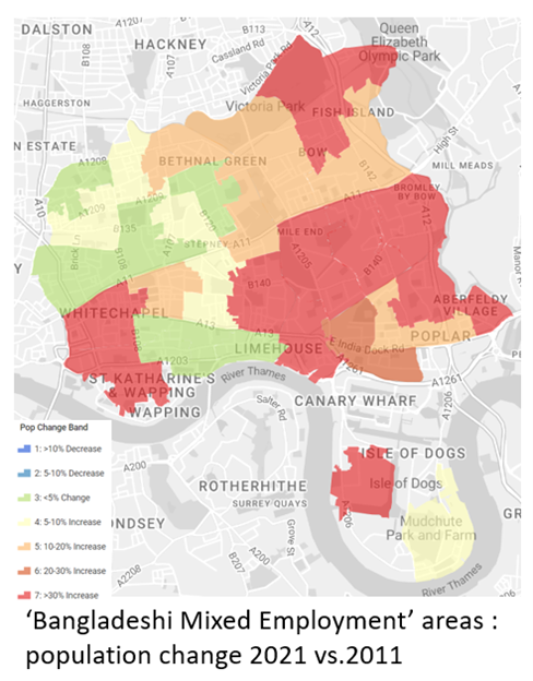
Another geodemographic group that has seen a large population increase is ‘Bangladeshi Mixed Employment’ – people from the Asian sub-continent whose first language is not English. These areas are mainly found in the London boroughs of Tower Hamlets, Camden & Islington. Overall this neighbourhood type has seen a population increase of 15.6% – almost 3 times the national average.
In our last blog about the Census we attributed the population growth in these areas of East London to the new flats and housing developments built in the last ten years. However geodemographic analysis by OAC suggests this could be due to inbound migration of skilled workers from India which has been widely reported in the media. It remains to be seen whether this influx has changed the characteristics of these areas in terms of the shops and business that will have opened up to serve their new residents. We will have to wait for the next generation of geodemographic classifications built from the 2021 Census data to find out.

This is the second in a series of posts from Newgrove covering insight from the 2021 UK Census datasets. Look out for our next article where we will present an analysis of the new deprivation data released last month by the ONS. Although the Census was before the current Cost of Living crisis, there will be areas that have become more or less deprived during the ten year period from 2011 to 2021. Newgrove’s analysis and mapping tools will reveal the location & characteristics of these areas.
For more information on the data & analysis used for this post, Periscope or other Newgrove services please get in touch by emailing info@newgrove.com.
